|
This is a 3-part endotoxin contamination story. The contamination part was easy. I cover that in this first part. But we pulled on a string that turned this into the craziest investigation I ever worked on. Now- Since this is an endotoxin story, I need to have the click bait picture used for every endotoxin article. Horseshoe crabs being harvested for their blue blood: 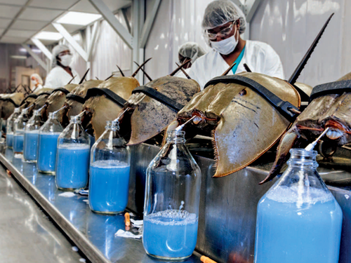 If you’re reading this, you probably have some background on:
If you don’t have that background, check out this radiolab episode. It’s crazy how the horseshoe crabs help us. I’ll dive into the test they help us with in part 2. The only background you need to know today: some bacteria release endotoxin when they die, and it’s bad if it’s in our injectable drugs. Also- Endotoxin is measured in Endotoxin Units (EU). Onto the contamination story. We got repeat failing endotoxin results from our distillations units. We got them seemingly randomly once or twice a year. These distillations units were the last line of defense between city water and our Water For Injection (WFI) distribution system. Distillation units are the standard in pharma water purification. They essentially boil “dirty” water, collect the steam, and condense it into pure water. Sure enough, sampling and testing contamination was blamed for each failing result. I wasn’t in an investigator role for most of those results. But when I got my chance, I used it to learn about the entire pre-treatment system. It was set up like this: 1st- We start with incoming city water. We usually had low bioburden counts because of the chloride/fluoride combo in city water. City water pipes are covered in biofilms, so we always had endotoxin from the dead bacteria that flaked off. There’s no endotoxin limit for these city water samples, but testing is a compendial requirement. 2nd- Water softeners. Gotta remove those cations that can corrode piping! We didn’t do micro testing on this equipment. 3rd- Carbon Beds. These remove anions like the chloride and fluoride. Incidentally, they allow bioburden to grow rampant. With nothing to hold back bioburden growth, and plenty of carbon rich surface area to grow on, this is a bacteria paradise. Bioburden results were often higher than our tests could count (>250 CFU/mL). We didn’t do endotoxin testing here. That’s ok, because next we have… 4th- Those distillation units! The manufacturer claims a 6-log reduction in bacteria levels after water passes through them. They let 1 bacterium through for every 1 million coming in. They often get much better reduction than that. And, if the bacteria is gone, they can’t bring endotoxin into the system. The weird thing about this set-up: The site had two other pretreatment systems for connected buildings. They were designed pretty much the same, except they had RO filters between the carbon beds and the distillation units. RO filters cut down a lot of the bioburden and endotoxin. When the new system was designed, the engineers were so confident in the distillation units‘ power that it was considered a waste of money to put RO units in this new system. We knew distillation units were great at cutting down bioburden. But we didn’t have a bioburden issue. I went to the distillation unit vendor and got some documents like this. They only claim a 3-log endotoxin reduction. On a high endotoxin day city water had ~50 EU/mL. If we had a 3 log reduction, that puts us at 0.05 EU/mL, which was the limit of detection for the test (The specification is 0.25 EU/mL). When bioburden proliferated in the carbon beds, the endotoxin levels grew. We had to do a special protocol to confirm that. Turns out it’s much easier to kill off bioburden with steam than it is to denature the endotoxin they leave behind. Previous investigations didn’t look into this because:
Something interesting came from the city water data though. Results were consistently between 5 and 50 EU/mL. We always recovered some endotoxin, except for two days (out of years of data). A new lab manager asked why we wouldn't detect it those 2 days. I thought I knew why, so I looked into it to confirm. I was half right, but the reason I was half wrong is what makes this the craziest investigation I ever worked on. You’ll get to read all about that in Part 2 and Part 3! A final note on the decision for/against RO units before the distillation units- I made it seem like the site “cheaped” out by not using them. Industrial RO units are expensive! Given how infrequent the high endotoxin results were, how diluted That endotoxin became when it mixed with the rest of the water in the system, and how simple it was to wash the carbon beds, there’s a case that the costs/benefits work out in that systems favor. To address this issue, we increased the flushing of the carbon beds, which reduced the bioburden/endotoxin loads on them. The horseshoe crab picture is from this website.
0 Comments
*In the 2 contexts I hear it most often. “Right First Time” (RFT) is a metric. It measures how frequently we complete a goal error free. We can measure batches made without discarded units, tests performed without deviations, shipments without damage, etc... When used appropriately, we can identify areas for improvement. By acting on that information, we can be RFT more often. That’s great, and it ties into my point at the end of this post. But there are 2 contexts in the manufacturing and quality environments where I hear RFT the most. Context 1: A New Manager Introducing Themselves. We’ve all been there. A new Manager/Director/Executive Team is new to the office, so they give a quick presentation to introduce themselves. The first couple slides discuss their family and background. Then they get to the “Management Style” slide. There always seems to be a bullet point for RFT. They emphasize it, saying it’s an expectation they have to make their group the best group possible. Everything should be done right the first time. Seems simple enough. What’s wrong with that? With that management style, RFT isn’t a metric you learn from, it’s an expectation. This expectation is held by someone outside the group that couldn’t possibly understand the nuances of the group’s work yet. Even if they're refering to how they use the RFT metric to identify process gaps, It gives an impression they don’t need to see, understand, or help with problems currently preventing RFT. Then, that attitude trickles down to the floor… Context 2: After an error occurs. I’ve posted a few manufacturing and testing investigations on this site. I plan to write about a lot more. For almost all these events, group leaders, supervisors, and managers were quick to blame manpower. Once they jump to that conclusion, the first thing they say to their team is predictable. “Come on guys, we want to be Right First Time”. Responding this way is useless and demoralizing. It’s like telling a child that just dropped their ice cream “Hey kid, try not to drop your ice cream”. At this point you’re too late. RFT isn’t possible.  Repeating RFT here re-enforces blaming manpower when we should be looking at process improvements (like- why would we even trust that girl to hold her own ice cream?). Conversations about the error circle around what an individual could have done differently to be RFT. That detracts from what you want to do as an organization . . . learn from this mistake to develop a system that can function RFT next time.
I propose a different mantra that can be used in both these contexts. "Learn and Improve". It's just as short and it meets the spirit of the RFT metric. I hope it catches on. I’m desperate for good news about the Coronavirus. I’m Jealous of New Zealand, Iceland, Taiwan, and South Korea. Maybe I just want to live on an island somewhere. As I link to those, I’m well aware of the size and diversity of the US posing a greater challenge for us. But good news is a double edged sword. If it seems like we’ve won the fight, then it discourages us from keeping up with preventative measures that work. Examples:
But it’s also important that good news about the virus is real. If we’re making decisions about the health of our community (and our own actions), it needs to be based on accurate information that’s not meant to mislead. Recently, a few charts were shared with me that are very misleading. I’m making this post to address them. I believe they were shared to counter the “fear” about the virus from the "media". When that “fear” diminishes, the current economic restrictions seem worse than the virus. The charts are all based off Ohio’s data. They were shared on 8/1/2020. The data is recent as of 7/31/2020. To be clear- all numbers are real from the Ohio department of health. I’m happy that, despite all the issues around gathering this data quickly, we can acknowledge this data is as close as we can get to what’s going on (i.e., the numbers aren’t “fake”). Before looking at the data, we have to know it’s lagging behind the actual spread. That’s the nature of the game. We find out who’s infected after the infection happens. Days to weeks after. With my past micro testing, results took 3-5 days for incubation. When I worked with customer complaints, we didn’t receive those until months after we made the product. I’ve learned there are a lot of ways to interpret lagging data, and there are constant calls to wait for more data before action. There’s loads of hospital and government bureaucracy the data goes through before it’s reported. There will be noise (I mean statistical noise, many of these cases are individually tragic):
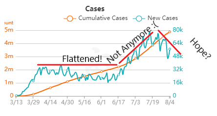
But overall, I generally trust the experts that have dedicated their career to medicine and public service. I definitely trust them more than friends and family arm-chair quarterbacking the situation. The first chart discusses new cases. 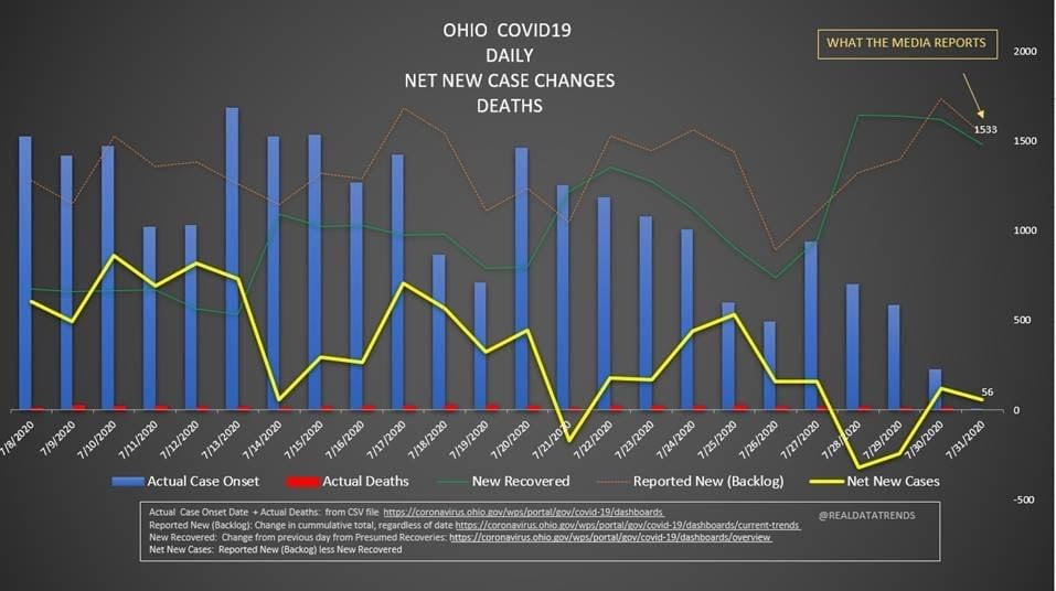 The blue bars are the most striking element on the chart for me. They’re distinct from all the line graphs. And they’re going down! Actual case onset is going down! This is great right? But what is "actual case onset"? For the purposes of this chart: when someone tests positive, they get lumped into the first day they started feeling symptoms or came in contact with a known carrier. If someone started feeling symptoms on those days, but haven’t gotten tested or haven’t gotten test results back, they’re not added to that date yet. As it takes time for people to get tested and get their results, recent days will always appear to have fewer cases. It’s like the makers of this chart purposely picked the earliest day they could to show a downward trend. As the virus is spreading, actual case onset is increasing. Full data for "actual case onset" lags by at least 2 weeks. The chart makes it look like only ~100 cases started on 7/30/2020. That number will inevitably rise as more data comes in. EDIT ON 8/11/2020- I just checked Ohio's official website. That number is now at 979 for 7/30/2020 The next most prominent element is the bright yellow line. This is the main point of the graph. Net new cases. The chart maker takes the amount of new reported cases (brown line) and subtracts the amount of new “presumed recovered” cases (green line). How does “net new cases” help us understand the spread of the virus? It’s a deceptive way of talking about Active cases. Active cases tell us how many people in the state are infected. On 8/1/2020, that number was ~20000. The yellow line shows a combination of how fast the spread is, and how many people were infected a month ago (long enough to be considered "presumed recovered"). Cool, but not really helpful. When the concern is virus spread, you want to know if more people are getting it this week compared to last week. 7/30/2020 and 7/31/2020 were the 1st and 4th highest new case counts in Ohio, the two most recent days on this chart. We've had high case spread for a month. Net new case count does not give an accurate picture of the spread. The last element on the chart is the death count. The red blips next to the blue columns. This is a visual representation of what’s been known since the virus first made its way to the states. 1-2% fatality rate for people with serious enough conditions to get tested. That means since April- Covid-19 is on pace as the 3rd leading cause of death in Ohio. Growing case counts won’t help that stat. The second chart shows cases and deaths by age. 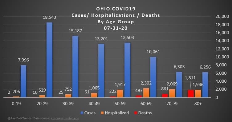 This chart emphasizes that the people who die are more likely to be older. It comes with a hint of "they were going to die anyway so their death isn’t as important". This is supposed to make younger people feel better. But it hides how:
The last chart discusses hospital data. 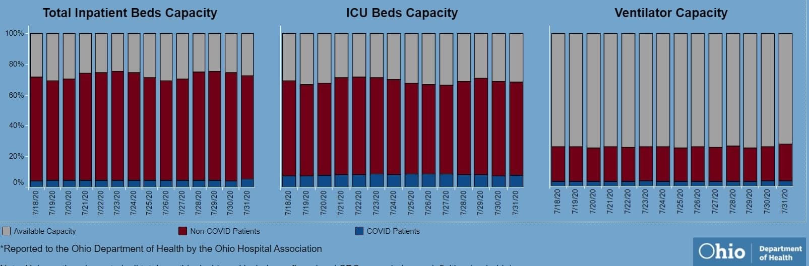 There’s open beds and ventilators in the state. That's great! But communicable diseases spread in local hot spots. Data from the entire state isn't too helpful here. It doesn't help my parents in Cleveland if there are open beds in Portsmouth, Marietta, or Springfield. That's why Ohio is going with the county color scheme now.
I'd love to have an answer for what the state (or country) could do to make the virus go away. I don't get to work with people closest to studying the virus's impacts, so my recommendations are moot. I just want our individual decisions (wear masks, socially distance, avoiding crowded indoor spaces, how to talk with others about the virus) to be based on an accurate representation of the problem. |
