|
I apologize in advance. This post is BORING (Although I’m proud of the cliff hanger ending). We get into the weeds of kinetic-chromagenic test equipment and how it determines endotoxin levels in a sample. This background is needed to understand the craziness of what happened. This is the 2nd part of a 3 part series. Part 1 discussed WFI system endotoxin contamination. The endotoxin came from pre-treatment water. We always had some level of endotoxin in the city water, but we wanted to know why we didn’t see it on two particular days. I believed I could answer that question by looking at the “unofficial” raw data from the test. The test measures endotoxin in a cool way. When the purified horseshoe crab blood (lysate) mixed with endotoxin, it turned the solution yellow. The equipment measured the yellow intensity throughout the test. The faster the samples turned yellow, the more endotoxin was there. When a sample reached a certain threshold, we said it “reacted” We tested with a 96 well plate like this: 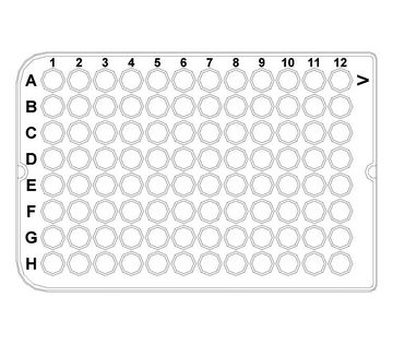 We added samples + lysate to each of those wells. When the test was done, the plate had a bunch of different shades of yellow. I made a mock-up in excel of what it kinda looked like. This shows what a plate with 9 samples looked like when it was done. (A plate could fit 20 samples if needed):  And this is what those shades represented: 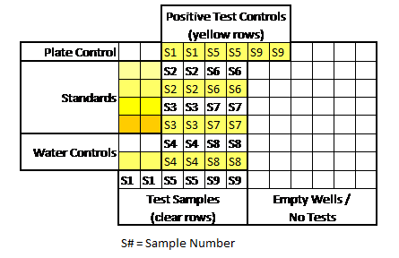 An official report was generated after each test. Results from the report were really the only thing management cared about. Those results allowed us to release a lot or confirm WFI was acceptable for use. But what else was on that report?
Some measurements had to line up for the entire test plate to be valid. A test plate was only valid if all the following occurred:
If we had a problem with any of those, the entire assay had to be repeated. Other weird stuff could happen too. Things like hot wells (when a single well reacted when it wasn’t expected to) required us to repeat individual tests. It was miserable when I got a hot well at the end of my shift. I’d be stuck at work for another hour. All information discussed above was on each final test report. What else could possibly be gathered from the raw data? During the test, every 2 minutes, the machine measured the intensity of yellow in each test well. The raw data contained all those measurements, plus a graph for each of those measurements over time. When I tested, I watched these graphs in real time hoping nothing looked out of the ordinary. The examples below show what those graphs looked like over the course of an assay. Remember, each little square is a graph for a corresponding well on the plate. 6 minutes in: The most concentrated standard started to turn yellow. Those tiny marks on the fifth row down represent a slight elevation in yellowness compared to the first measurement taken. No changes are detected for the other wells. At this time, the plotted lines are indistinguishable from the X axis for those wells. 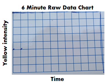 16 minutes in: The most concentrated standard has reached the reaction threshold. It will continue to increase in yellow intensity (which explains why it looks darker when the assay is complete), but any further change is irrelevant to the assay. The 2nd most concentrated standard is almost at the threshold. The color change for the 3rd standard and positive controls are just starting to be detected. 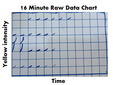 36 minutes in: Every standard and control has reached the threshold except for the most dilute standard. What’s interesting here- we see all the tests and negative controls start to change color. That’s right! Lysate will turn yellow on its own over time, even if no endotoxin is there! 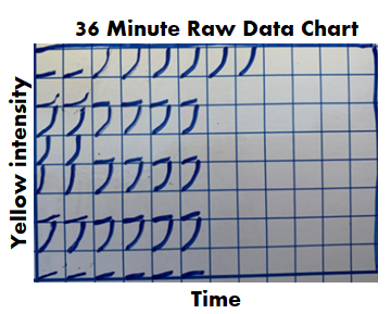 46 minutes in: The assay is complete. The final graph doesn’t look much different than the 36 minute graph: 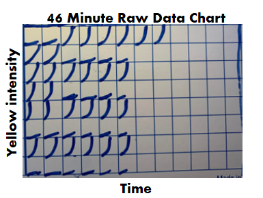 Phew! The background is all laid out. I can finally explain what I expected to see for those 2 city water samples with no endotoxin. I thought the graphs for the duplicate test wells would look like the circled wells here: 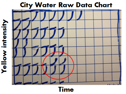 To me, those graphs say some endotoxin was there, it just wasn’t enough to meet the threshold. The line rose faster than the negative control samples, but the endotoxin level was just below the most diluted standard we tested.
For one of the 2 days in question, that was exactly what I saw. It completely made sense. Endotoxin levels were just a bit lower than the low end of our normal range. If the lowest standard had 0.05 EU/mL, this city water sample probably had 0.03 EU/mL. No big deal. On the other day in question, I saw . <-- I fill in that blank in Part 3. (If you really paid attention, you’ll know how this isn’t a cliff hanger).
0 Comments
This is a 3-part endotoxin contamination story. The contamination part was easy. I cover that in this first part. But we pulled on a string that turned this into the craziest investigation I ever worked on. Now- Since this is an endotoxin story, I need to have the click bait picture used for every endotoxin article. Horseshoe crabs being harvested for their blue blood: 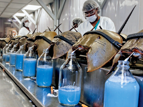 If you’re reading this, you probably have some background on:
If you don’t have that background, check out this radiolab episode. It’s crazy how the horseshoe crabs help us. I’ll dive into the test they help us with in part 2. The only background you need to know today: some bacteria release endotoxin when they die, and it’s bad if it’s in our injectable drugs. Also- Endotoxin is measured in Endotoxin Units (EU). Onto the contamination story. We got repeat failing endotoxin results from our distillations units. We got them seemingly randomly once or twice a year. These distillations units were the last line of defense between city water and our Water For Injection (WFI) distribution system. Distillation units are the standard in pharma water purification. They essentially boil “dirty” water, collect the steam, and condense it into pure water. Sure enough, sampling and testing contamination was blamed for each failing result. I wasn’t in an investigator role for most of those results. But when I got my chance, I used it to learn about the entire pre-treatment system. It was set up like this: 1st- We start with incoming city water. We usually had low bioburden counts because of the chloride/fluoride combo in city water. City water pipes are covered in biofilms, so we always had endotoxin from the dead bacteria that flaked off. There’s no endotoxin limit for these city water samples, but testing is a compendial requirement. 2nd- Water softeners. Gotta remove those cations that can corrode piping! We didn’t do micro testing on this equipment. 3rd- Carbon Beds. These remove anions like the chloride and fluoride. Incidentally, they allow bioburden to grow rampant. With nothing to hold back bioburden growth, and plenty of carbon rich surface area to grow on, this is a bacteria paradise. Bioburden results were often higher than our tests could count (>250 CFU/mL). We didn’t do endotoxin testing here. That’s ok, because next we have… 4th- Those distillation units! The manufacturer claims a 6-log reduction in bacteria levels after water passes through them. They let 1 bacterium through for every 1 million coming in. They often get much better reduction than that. And, if the bacteria is gone, they can’t bring endotoxin into the system. The weird thing about this set-up: The site had two other pretreatment systems for connected buildings. They were designed pretty much the same, except they had RO filters between the carbon beds and the distillation units. RO filters cut down a lot of the bioburden and endotoxin. When the new system was designed, the engineers were so confident in the distillation units‘ power that it was considered a waste of money to put RO units in this new system. We knew distillation units were great at cutting down bioburden. But we didn’t have a bioburden issue. I went to the distillation unit vendor and got some documents like this. They only claim a 3-log endotoxin reduction. On a high endotoxin day city water had ~50 EU/mL. If we had a 3 log reduction, that puts us at 0.05 EU/mL, which was the limit of detection for the test (The specification is 0.25 EU/mL). When bioburden proliferated in the carbon beds, the endotoxin levels grew. We had to do a special protocol to confirm that. Turns out it’s much easier to kill off bioburden with steam than it is to denature the endotoxin they leave behind. Previous investigations didn’t look into this because:
Something interesting came from the city water data though. Results were consistently between 5 and 50 EU/mL. We always recovered some endotoxin, except for two days (out of years of data). A new lab manager asked why we wouldn't detect it those 2 days. I thought I knew why, so I looked into it to confirm. I was half right, but the reason I was half wrong is what makes this the craziest investigation I ever worked on. You’ll get to read all about that in Part 2 and Part 3! A final note on the decision for/against RO units before the distillation units- I made it seem like the site “cheaped” out by not using them. Industrial RO units are expensive! Given how infrequent the high endotoxin results were, how diluted That endotoxin became when it mixed with the rest of the water in the system, and how simple it was to wash the carbon beds, there’s a case that the costs/benefits work out in that systems favor. To address this issue, we increased the flushing of the carbon beds, which reduced the bioburden/endotoxin loads on them. The horseshoe crab picture is from this website. *In the 2 contexts I hear it most often. “Right First Time” (RFT) is a metric. It measures how frequently we complete a goal error free. We can measure batches made without discarded units, tests performed without deviations, shipments without damage, etc... When used appropriately, we can identify areas for improvement. By acting on that information, we can be RFT more often. That’s great, and it ties into my point at the end of this post. But there are 2 contexts in the manufacturing and quality environments where I hear RFT the most. Context 1: A New Manager Introducing Themselves. We’ve all been there. A new Manager/Director/Executive Team is new to the office, so they give a quick presentation to introduce themselves. The first couple slides discuss their family and background. Then they get to the “Management Style” slide. There always seems to be a bullet point for RFT. They emphasize it, saying it’s an expectation they have to make their group the best group possible. Everything should be done right the first time. Seems simple enough. What’s wrong with that? With that management style, RFT isn’t a metric you learn from, it’s an expectation. This expectation is held by someone outside the group that couldn’t possibly understand the nuances of the group’s work yet. Even if they're refering to how they use the RFT metric to identify process gaps, It gives an impression they don’t need to see, understand, or help with problems currently preventing RFT. Then, that attitude trickles down to the floor… Context 2: After an error occurs. I’ve posted a few manufacturing and testing investigations on this site. I plan to write about a lot more. For almost all these events, group leaders, supervisors, and managers were quick to blame manpower. Once they jump to that conclusion, the first thing they say to their team is predictable. “Come on guys, we want to be Right First Time”. Responding this way is useless and demoralizing. It’s like telling a child that just dropped their ice cream “Hey kid, try not to drop your ice cream”. At this point you’re too late. RFT isn’t possible.  Repeating RFT here re-enforces blaming manpower when we should be looking at process improvements (like- why would we even trust that girl to hold her own ice cream?). Conversations about the error circle around what an individual could have done differently to be RFT. That detracts from what you want to do as an organization . . . learn from this mistake to develop a system that can function RFT next time.
I propose a different mantra that can be used in both these contexts. "Learn and Improve". It's just as short and it meets the spirit of the RFT metric. I hope it catches on. I’m desperate for good news about the Coronavirus. I’m Jealous of New Zealand, Iceland, Taiwan, and South Korea. Maybe I just want to live on an island somewhere. As I link to those, I’m well aware of the size and diversity of the US posing a greater challenge for us. But good news is a double edged sword. If it seems like we’ve won the fight, then it discourages us from keeping up with preventative measures that work. Examples:
But it’s also important that good news about the virus is real. If we’re making decisions about the health of our community (and our own actions), it needs to be based on accurate information that’s not meant to mislead. Recently, a few charts were shared with me that are very misleading. I’m making this post to address them. I believe they were shared to counter the “fear” about the virus from the "media". When that “fear” diminishes, the current economic restrictions seem worse than the virus. The charts are all based off Ohio’s data. They were shared on 8/1/2020. The data is recent as of 7/31/2020. To be clear- all numbers are real from the Ohio department of health. I’m happy that, despite all the issues around gathering this data quickly, we can acknowledge this data is as close as we can get to what’s going on (i.e., the numbers aren’t “fake”). Before looking at the data, we have to know it’s lagging behind the actual spread. That’s the nature of the game. We find out who’s infected after the infection happens. Days to weeks after. With my past micro testing, results took 3-5 days for incubation. When I worked with customer complaints, we didn’t receive those until months after we made the product. I’ve learned there are a lot of ways to interpret lagging data, and there are constant calls to wait for more data before action. There’s loads of hospital and government bureaucracy the data goes through before it’s reported. There will be noise (I mean statistical noise, many of these cases are individually tragic):
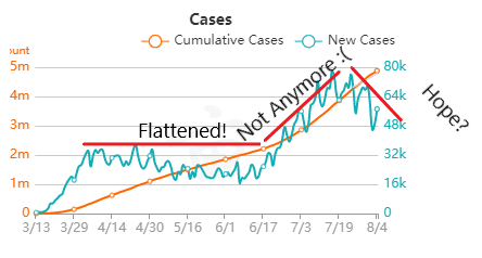
But overall, I generally trust the experts that have dedicated their career to medicine and public service. I definitely trust them more than friends and family arm-chair quarterbacking the situation. The first chart discusses new cases.  The blue bars are the most striking element on the chart for me. They’re distinct from all the line graphs. And they’re going down! Actual case onset is going down! This is great right? But what is "actual case onset"? For the purposes of this chart: when someone tests positive, they get lumped into the first day they started feeling symptoms or came in contact with a known carrier. If someone started feeling symptoms on those days, but haven’t gotten tested or haven’t gotten test results back, they’re not added to that date yet. As it takes time for people to get tested and get their results, recent days will always appear to have fewer cases. It’s like the makers of this chart purposely picked the earliest day they could to show a downward trend. As the virus is spreading, actual case onset is increasing. Full data for "actual case onset" lags by at least 2 weeks. The chart makes it look like only ~100 cases started on 7/30/2020. That number will inevitably rise as more data comes in. EDIT ON 8/11/2020- I just checked Ohio's official website. That number is now at 979 for 7/30/2020 The next most prominent element is the bright yellow line. This is the main point of the graph. Net new cases. The chart maker takes the amount of new reported cases (brown line) and subtracts the amount of new “presumed recovered” cases (green line). How does “net new cases” help us understand the spread of the virus? It’s a deceptive way of talking about Active cases. Active cases tell us how many people in the state are infected. On 8/1/2020, that number was ~20000. The yellow line shows a combination of how fast the spread is, and how many people were infected a month ago (long enough to be considered "presumed recovered"). Cool, but not really helpful. When the concern is virus spread, you want to know if more people are getting it this week compared to last week. 7/30/2020 and 7/31/2020 were the 1st and 4th highest new case counts in Ohio, the two most recent days on this chart. We've had high case spread for a month. Net new case count does not give an accurate picture of the spread. The last element on the chart is the death count. The red blips next to the blue columns. This is a visual representation of what’s been known since the virus first made its way to the states. 1-2% fatality rate for people with serious enough conditions to get tested. That means since April- Covid-19 is on pace as the 3rd leading cause of death in Ohio. Growing case counts won’t help that stat. The second chart shows cases and deaths by age. 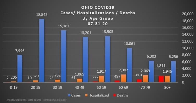 This chart emphasizes that the people who die are more likely to be older. It comes with a hint of "they were going to die anyway so their death isn’t as important". This is supposed to make younger people feel better. But it hides how:
The last chart discusses hospital data. 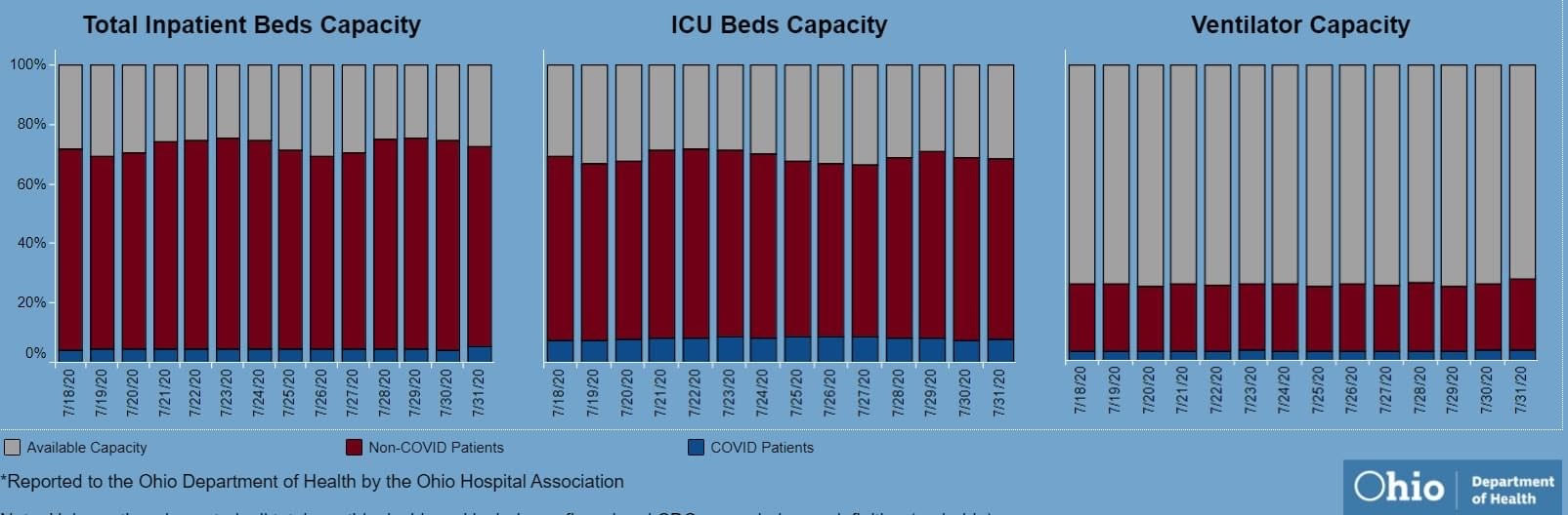 There’s open beds and ventilators in the state. That's great! But communicable diseases spread in local hot spots. Data from the entire state isn't too helpful here. It doesn't help my parents in Cleveland if there are open beds in Portsmouth, Marietta, or Springfield. That's why Ohio is going with the county color scheme now.
I'd love to have an answer for what the state (or country) could do to make the virus go away. I don't get to work with people closest to studying the virus's impacts, so my recommendations are moot. I just want our individual decisions (wear masks, socially distance, avoiding crowded indoor spaces, how to talk with others about the virus) to be based on an accurate representation of the problem. Welcome back to the final segment of this series! You can catch up on Part 1, Part 2, Part 3, and Part 4 <-- right there! To sum up all 4 of those parts- We solved a Bioburden problem! Product contact piping wasn’t getting cleaned between runs. It seems so easy in hindsight. All we had to do was adjust the cleaning cycle. How could we mess that up? That’s exactly what I’ll go into in this final part of the series. We went a year before finding our biggest mistake. I was instructed to close the investigation when we figured out the bacteria’s source. Then, engineering opened a second investigation to document why the piping wasn’t getting cleaned. Their corrective action plan wasn’t too complicated. They updated cleaning cycles to:
So what happened a year later? We got another bioburden OOL at the same manufacturing step. This time it was a hodge-podge of gram-negative water organisms. Mostly Stenotrophomonas. The old gang got back together to look it over. Site management followed this one even closer, knowing we were now delaying active commercial runs. The Engineering manager confirmed CIPs were performed before the run. The team had another equipment inspection and swabbing party. We found lots of gaskets in poor condition, so we replaced them and scheduled a contract cleaner again. This was major déjà vu, so I reached out to the engineering techs. I wanted to learn more about the cleaning programming. Our talk was all we needed to find the new root cause. For the entire year, the site was only using one of the pooling vessels. A few runs before this OOL result, the qualification for the second pooling vessel was complete, so it started to get used. Although the operators could now choose the appropriate CIP inlet, there was no procedure to prompt operators on which one to use. The CIP cycle continued to run through the same inlet. When the 2nd pooling vessel was used, the same section of piping wasn’t getting cleaned (circled in red below). 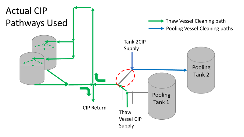 This was also fixable! The operating system required a cleaning cycle to be performed before a tank could be used. We designated that circled section of piping to register like a tank. The system would electronically “block” that section from being used if it wasn’t cleaned. We would never have this problem again! This problem would have easily been identified had we walked through the process from an operator’s perspective the first time we “solved” the bioburden issue. But there were other system problems that should have been solved with the first investigation. Quality improvements are normally seen as extra costs and delays. But these quality improvements can go hand in hand with manufacturing efficiencies. I have two examples from this critical investigation. Manufacturing efficiency example 1: Operators were frustrated with cleaning delays. They couldn’t clean tank 1 while the system was running to tank 2 (and vice versa). This didn’t make sense. The equipment was designed to allow for that. There were multiple block valves between the CIP inlets and the opposing product lines. 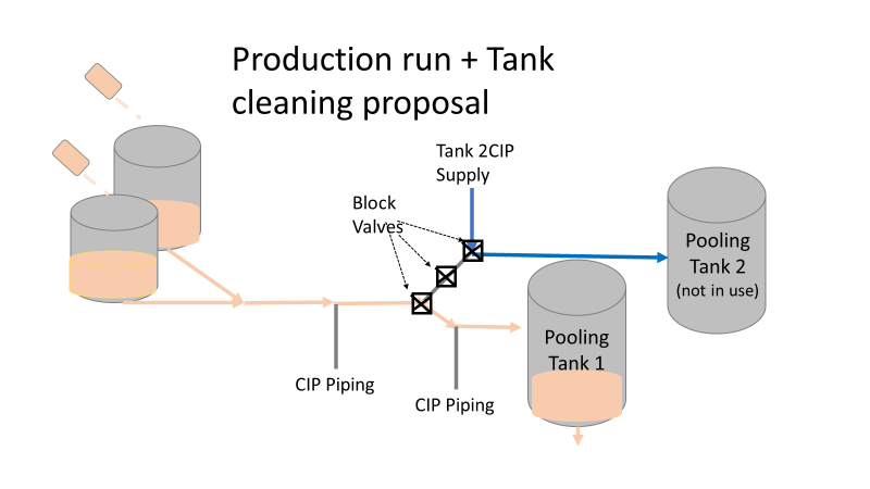 This problem became my green belt project. I left the company before the change was completed, but we had a plan in place when I left. In the scenario above, the production run “owned” those 3 valves. This prevented any other cycle that could use those valves from starting. All we needed to do was update ownership of the valves in those cycles, and we could save the production team 3 HOURS between each run. This was huge for a site planning to increase from 10 to 14 runs per week. With the experienced group of engineers working on the bioburden issue, this delay could have easily been fixed during the initial investigation. This was another example of not looking at the system through the lens of the people using it. Manufacturing Efficiency Example 2. I discussed in the earlier parts of this investigation that the microbiologists were pre-occupied with the bottle transfer process. The bottle rinsing chamber caught their eyes. The rinse chambers had open-able windows lined with gaskets. During the investigation, the gaskets were removed to swab their housing. The swabs were covered in black residue. There were no bacteria in any of these samples. However, the residue was so concerning that we made a major update to the chamber cleaning process. The new SOP required gaskets to be removed, cleaned, and placed back into position between each run. This added a huge extra delay to the cleaning process. There were 12 gaskets. It took a half hour to clean them all. 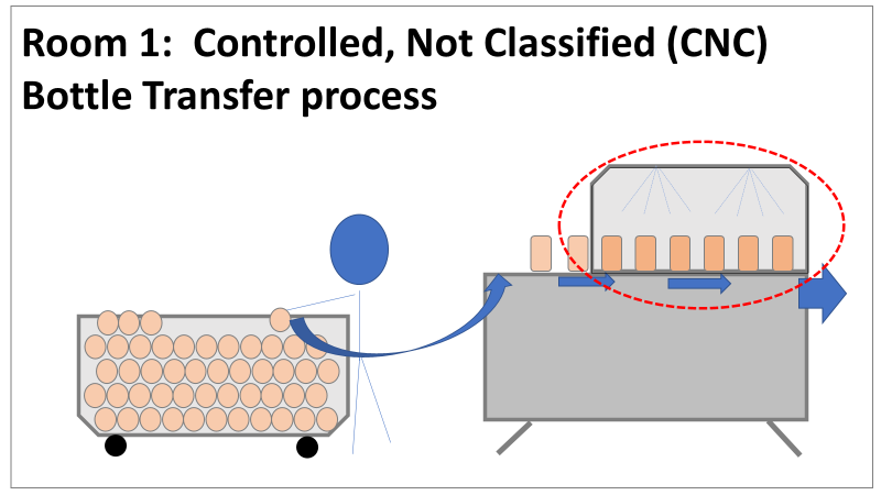 The extra quality problem the cleaning caused was even worse.
The gaskets’ integrity deteriorated between each manipulation. Over time, they stopped forming a good seal. There were even times where operators replaced them backwards (this was very easy to do). This led to major leaks during runs, flooding the bottle transfer rooms. The initial investigation team added a time-consuming process that wore down equipment and caused leaks in the manufacturing area. The team was grasping at straws for a root cause. They pushed the change to feel like they were doing something to make the system cleaner each run. If you read (red/reed) part 3 of this series, you’ll see why they never should have considered that area as a source. Cleaning the gasket housing as part of the routine equipment PM would have been sufficient to address the residue issue. I created the SOP redline for the process owners to remove the gasket cleaning process. It was never given priority (likely because the process was stopped without changing the procedure). The site probably still has the cleaning instructions in their procedure. There are other compliance issues if an effective SOP is not being followed. The major take away from the last part of this series- walk through your processes from the point of view of your operators. This is text-book poka yoke. Poka yoke is often taught in a quality/error-proofing context. But when you’re given this opportunity to look for production improvements, use it! P.S.- Blaming gaskets for a micro issue is lazy. You can look at any piping system (with or without bioburden issues) and find gaskets in poor condition. Finding them doesn’t mean they’re the cause of the issue. Welcome to the 4th part of this Bioburden contamination Investigation! Part 1, Part 2, and Part 3 emphasized this investigation’s importance, what was going wrong, and how we should have thought about the problem. I haven’t been too clear on order of events, so let’s catch up on that. The site ran 3 Engineering runs without contamination. Run 4 was overgrown with Bioburden (Bacillus). The investigation blamed the use of a pool skimmer in the pooling vessel. Run 5 was also overgrown with Bacillus. During this month-long investigation:
Commercial Runs 1 and 2 ran back to back within a week. Run 1 had elevated Bacillus recovery, but below the established limit. Run 2 was OOL. New SMEs were brought in from sister sites. More swabbing was performed, and the team spent more time looking into bottle prep activities as the organism’s source. Another contractor cleaning was planned before run 3. The team was running out of clues but needed to wrap up the investigation. We didn’t have a choice; we would close the investigation and blame our best guess by run 3's planned start date. Less than a week before the investigation due date, the team was ranking which part of the bottle prep process was the most likely culprit. My mind was wandering to the cleaning validation results. Rinse samples were collected from most of the the pre-run equipment cleanings as part of the Clean-In-Place (CIP) validation. A few had Bacillus recoveries. Validation and Engineering were happy with the results because they met requirements. But of all the investigational tests performed, these ones hinted the organism was in the equipment in its cleanest state. The Engineering and Validation groups gave a presentation on the equipment and CIP process early in the investigation. The investigation team (including me) were out of our element for this. The engineering diagrams looked like an old school Windows screen saver to me.  We trusted the presentation. It made sense cleaning was performed correctly. When we looked at the actual equipment it looked simple enough, like the diagram below. Product went in one direction from the thaw vessels to the pooling vessels. Product contact piping is highlighted in pink. 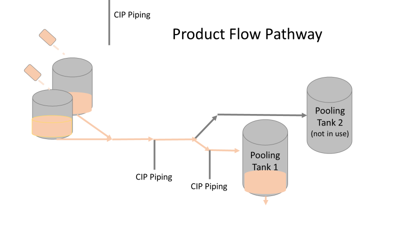 The cleaning process seemed just as simple. We saw where the CIP piping was connected to the thaw and pooling vessels. We also knew the thaw and pooling vessels couldn't be cleaned at the same time due to pathway overlap, So the team walked out of the presentation understanding the CIP paths looked like this: 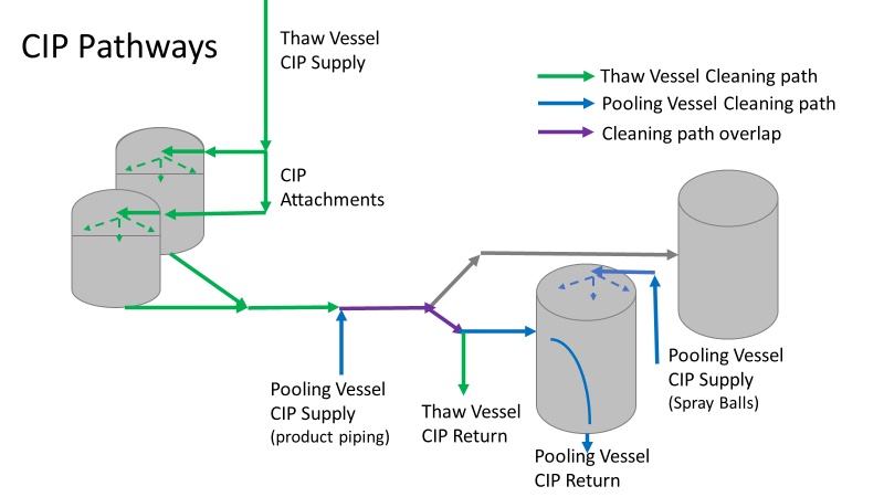 I spent a lot of time walking the product pathway in the mechanical areas. There were some valves and pipes that didn’t make sense to me. You can see those pipes circled below: 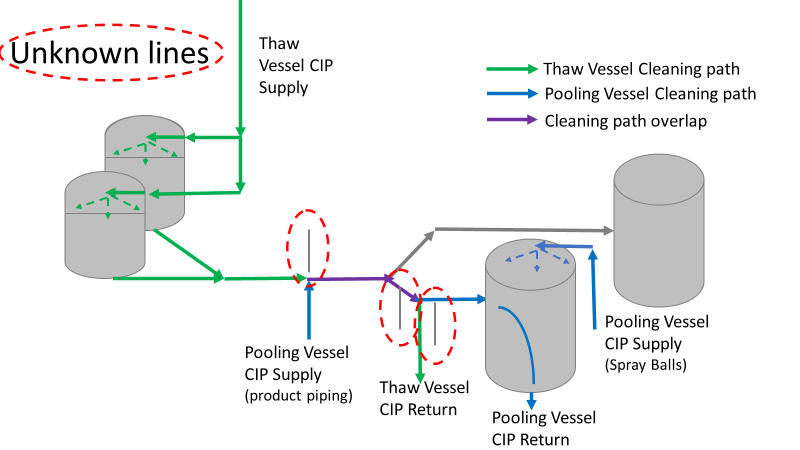 It bothered me not knowing what those pipes did. I asked the engineers. They didn’t seem concerned. They were CIP and drain pipes. This late in the investigation, I couldn't get a chance to talk out how they fit in the system. To help learn their fit- I pushed for a better rinse test than CIP samples. I was able to convince my manager to do exactly that test by talking him through the next diagram. CIP samples aren’t representative of every product contact piping section. It’s impossible to clean a tank by sending cleaning agents through the product inlet. To clean the tank, we use spray balls inside the tank lid. One CIP cycle runs through the product inlet, and a separate cycle runs through the tank spray balls. Rinse samples are collected from water that went through the spray ball pathway. These samples represent the cleanliness of the tank, the biggest product contact area. That means the test doesn’t tell us about the condition of the product inlet (circled in red below) 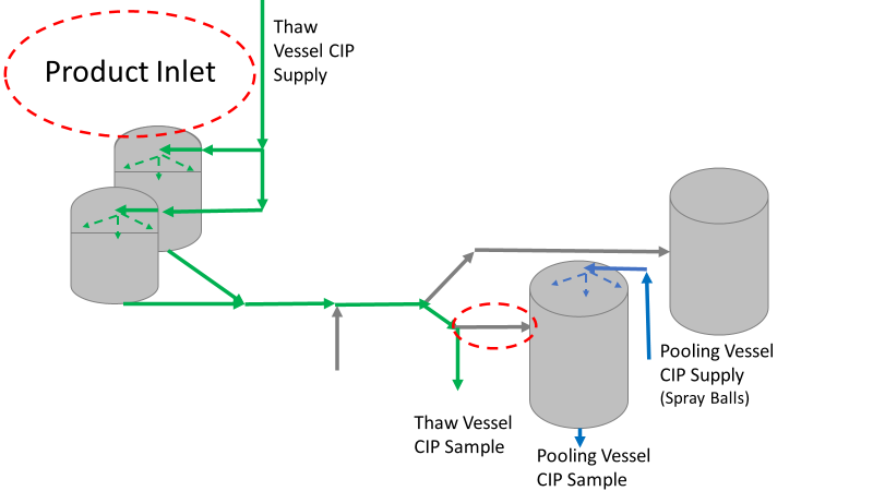 My manager presented the test idea to site leadership (I’m still a little salty I wasn’t given credit). After run 3, the equipment was CIP’d and rinse samples were collected from the green and blue paths above. We then altered the valve sequencing to send water through the green path below. 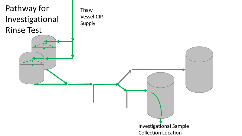 Run 3 bioburden results and the routine CIP rinse samples came back great. Site management started prepping raw material for run 4 thinking the investigation team figured it out. The investigational rinse samples were collected late enough that they were tested a day later. We convinced the production team to hold off starting run 4 until these results were ready. We were glad they did! These plates came back COVERED in Bacillus! They had to delay the start of run 4. So what happened? The results forced the engineering team into overdrive figuring this out. We were confident the product inlet section I circled was getting clean- we could tell water and cleaning agents were entering the tank through that inlet during the CIP cycle. As we looked further into the equipment I learned how the CIP actually worked. The thaw and pooling vessels had the same CIP source. To clean the thaw vessels, water flowed upstream from an entrance near the pooling vessel, diverted to non-product contact piping, then came back into the product pathway at the thaw vessel lid. 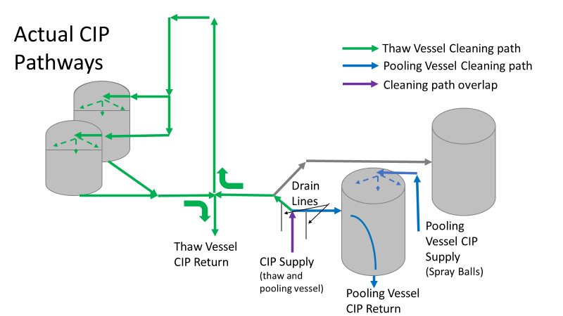 This was great! Well, not so great. This explains how a source of contamination in downstream pipes (where we had overgrown swabs) could spread to the top of the line. It also made us realize a mistake when we set up the system. There was a plan in place for scheduling the pooling vessels when the site was designed. Each pooling vessel would only receive raw material from a dedicated set of thaw vessels. The cleaning pathways were set up according to this plan. As a result, when the second set was used for the tank they weren’t dedicated to, a significant portion of the piping wasn’t getting cleaned. Broth residue remained in this spot between runs, growing the billions of bacteria needed for such huge bioburden recoveries. That section is circled in red here: 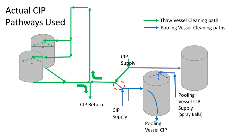 That still leaves a couple major questions.
1. How did the results meet requirements for run 3? The engineering team thought the contractor was using a better chemical to kill this spore-forming Bacilli. However, the contract cleaner couldn’t use the same CIP inlets for their cleaning agent. So, they had to manually adjust valves similar to how we ran the investigational testing. This allowed the contactor to clean all product contact piping. The cleaning process wasn’t as effective prior to commercial run 1 because there was so much time for the drain piping issue to impact the run… 2. What’s the drain piping issue, and why was Bacillus in the first set of thaw vessels? Drain valves throughout the line are opened after each product run and CIP. These openings allow residual broth to enter the drain line. There was no cleaning cycle to remove this broth from the drains. The drains pictured above lead to an ISO 8 space with high air pressure. Now imagine the draining process like you’re emptying a 2L soda bottle. Air gurgles into the bottle to replace the liquid. After the CIP, high pressure air pushes through the drain back into the product line, carrying any bacteria in the broth residue along the way. Now we have our two root causes:
We had to reject $2 million worth of raw material from commercial runs 1 and 2 to figure that out. Luckily, the last-minute test added between runs 3 and 4 saved the next million dollar batch. To correct these issues, all we did was alter the CIP cycles to clean the implicated areas. In part 5, I’ll show how we failed on the follow through. I'm proud of this video I made about a seemingly minor investigation. I was disappointed by how glitchy the recording came out. Either way, the story emphasizes the need to look beyond human error, so I hope you find it interesting. If the glitches are too much, I posted the script I used below. Slide 1:
Hi everyone! We’re doing my 6th gripe – Manpower. Part 2. This is a real example I encountered in a previous job. I’m excited to try some animation software. Slide 2: Stop me if you’ve heard this one before. A microbiologist walks into a lab with some test samples Slide 3: She checks the labels and her SOP to know the right test methods Slide 4: She documents what she’s testing on her paperwork Slide 5: Then she safely completes her tests for the day. Slide 6: 3-5 days later, she reads results… Slide 7: …and turns in her paperwork for review Slide 8: But the Supervisor notices something wrong! The microbiologist documented a product test, but the lot number was for media. This means the sample was tested per the wrong method! Slide 9: The supervisor and Lab manager conclude this is an obvious human error. The Microbiologist had a media sample. There were clear directions in the SOP for testing a media sample, but she tested it per a product method. She begrudgingly admitted she made an error, so they pulled me in to write this up in the deviation report. Look at me there, so smug. (PAUSE!!!) In the grand scheme of things, there was little impact with this event, so I was to close this investigation quickly to keep the deviation closure metrics looking good. It should be easy, right? the root cause was already known (manpower – human error), and the tester admitted to it. (PLAY!!!) Slide 10: If you saw my last video, you know I don’t buy into manpower root causes too easily. So I talked to the analyst to understand how she tests. Wasn’t there something suspicious earlier? Slide 11: The sample label said to test per the product method! As there are no other spots on the label with the product name, the testers always look to that test method line for sample identity. (PAUSE!!!) This wasn’t obvious to confirm- Sample containers are routinely destroyed with their labels during testing. It took a lot of digging in the label generation system to find out what the label looked like when she received it. Slide 12: I pushed against the manpower root cause. The analyst tested the way the GMP label told her to test. Slide 13: Management pushed back with a bunch of reasons this was the tester’s fault.
Slide 13: I need to take a break from animations to show context of those arguments:
Slide 15: I worked with the labeling system administrator while the root cause assignment sorted itself out. Since the media was for production study, test samples were labeled to mimic the product, including the label’s method. All future media tests were also set up this way. All we had to do was make a simple change in the system to label future media samples with the media method. Slide 16: I understand blaming manpower is tempting here. But had we blamed manpower when management wanted me to, the ONLY benefit would have been a short-sighted check mark on the investigation closure metric. Slide 17: By looking at the system from the Microbiolgist’s point of view, we made simple, meaningful change to prevent this issue in the future. Sure,
That doesn’t mean human error was the root cause. Those factors pale in comparison to the fact that the GMP label told her it was the wrong sample. We just needed to dig for this real root cause. Thanks again everyone for watching- I hope you liked it! Welcome back to part 3 of this investigation series. I don’t know how to select the picture that pops up when I post an article. It always shows the first picture in the article. So here’s a Bacillus Bunny. I’ll get to how it’s relevant by the end. 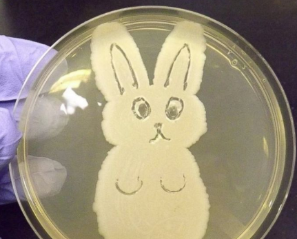 Part 1 of this series presented the bioburden issue. Part 2 discussed the team we put together and our initial findings. In part 3, I want to go over what our team did. During the equipment swabbing party, the team noticed multiple gaskets in poor condition. These gaskets were viewed as one source for harboring the organism, allowing it to proliferate between and during each run. The engineering specialists focused on remediating that issue short term (gasket replacements) and long term (better preventative maintenance). They even brought in an outside contractor to run a special cleaning agent through the lines after all this maintenance was performed. This was all done between the last engineering run and the first commercial run. Despite these gasket issues-
Therefore, most investigation time focused on the organism’s source: either room 1 in the CNC or room 2 in the ISO 8 area. As a reminder, this is what those rooms looked like.
This investigation got the attention and resources of a final product sterility failure. Since the source of the organism was unknown, it was also investigated like a sterility failure. The micro experts were VERY good at pointing out non-sterile aspects of Rooms 1 and 2. That was evident during the brainstorming session of the Analyze phase of the investigation. The team spent a month performing the investigation this way. We swabbed all over these rooms and never found the same organism. Recovery of any Bacillus species were rare. We collected water samples directly from the conveyor belt rinsing station. We pored over manual cleaning practices for any imperfection in procedure. We spent way too much time seriously discussing the possibility that:
Also- What’s the most obvious non-sterile aspect of these rooms? People! The team’s hypotheses were filled with different ways of blaming people.
Manpower flooded our 6M fishbone diagram. Blaming manpower is a pet peeve for me. But the most frustrating part- All hypotheses were investigated individually when we could have addressed them all as a single question: Could contamination from an unseen/unnoticed source in Room 1 or Room 2 have caused our OOL Results? For perspective on that question, let's do some math! 250 colonies is the limit that can be visually differentiated on a test plate. When there are more colonies on the plate, they start to grow into each other. Recoveries greater than 250 are considered too numerous to count. Therefore, test results were documented as >250 CFU(colony forming units)/mL Multiply 250 CFU/mL by 1000mL/L, and you have 250,000 CFU per liter. A batch of this raw material is 7000 liters. Assuming the organism was evenly distributed (based on our ultimate root cause, it likely was), we had 1,750,000,000 CFUs. That’s over 1 billion colony forming units in the pooling vessel at the time of sample collection. Billion, with a B. The background for this next value gets a little fuzzy, so reach out to me if you want to know my reasoning on it. A small, single colony of Bacillus on a test plate contains roughly (very roughly) 1 million cells. That means a single test filter covered in Bacillus contains about 250 million bacterial cells. Remember the Bacillus Bunny? check it out to see what 250 million bacterial cells looks like. Test filters are about the size of the Bacillus Bunny’s belly. Imagine taking seven test filters covered in Bacillus, scraping all the organisms off, then rolling that mess into a ball. It’d be roughly the size of a large marble. That’s what 1.75 Billion CFUs would look like with no vector (dirt, water, fabric, etc…) involved.
The entire team of microbiologists should have been extremely skeptical of any root cause hypothesis that required this much bacteria to be introduced during the manufacturing process. That level of contamination doesn’t happen when an operator holds a non-sanitized glove over an open tank (or any of the other guesses above). We should have been especially skeptical of that much bioburden being introduced to the product stream without the vector being noticed. It’s possible some proliferation occurred between the cleaning cycle and sample collection. But the temperature of the manufacturing lines was controlled at 0°C. Organisms can grow at that temperature, but a quick change to such a stressful environment is hard on microbes. They are not likely to grow to such huge levels so quickly after that transition. I was met with some resistance when I pushed back against the momentum of the investigation. According to our black belt facilitator, we were to follow up on all brainstorming outcomes. Resisting that made me look like I wasn’t a team player. Also, I couldn’t say making the process cleaner was a bad thing. The team had a lot of comfort improving what they could control, especially when we were finding less than optimal practices. But cleaning up non-sterile practices wasn’t the goal of the investigation. This process was designed to function in a non-sterile environment. We needed to know why our counts were so consistently high. After the 2nd failing commercial run, the team started to feel defeated with their efforts. As the team got more desperate, my idea for a unique test got some traction. I drew from experience with CIP cleaning validations to design a test that finally gave us a meaningful lead. You’ll get to read all about it in Part 4! Also, Part 5 is now complete! Credit to this ABC News report where I found the Bacillus Bunny picture. It was originally posted on the American Society for Microbiology's facebook page. Welcome to part 2 of this investigation series! You can catch up on Part 1 right here. This investigation started with an immediate smoking gun! The pooling vessel had foaming issues and frozen broth chunks. The operators stuck a pool strainer into the tank to mix things up.  You read that right. They used a non-controlled pool strainer that’s not mentioned in any procedure. I still have no idea where it came from. They brought it through a CNC/ISO 9 transition zone, moved it through an ISO 9/ ISO 8 transition zone, opened the manhole entrance at the top of the tank, stuck it in the broth, then swirled it around for half an hour. When I interviewed the operators, they emphazied the exhorbitant amount of alcohol used to sanitize the tool in each transition zone. They wiped down each and every crevice, including inside the extension poles. But this was as obvious of a smoking gun as possible. We didn’t want to delay the start of the next engineering run (the last one scheduled). I wrote up the investigation report, also addressing a few extra potential contributors like maintenance performed on the mechanical transfer arm during the thawing process and an issue with the sample tubing. The report included all WFI, Environmental Monitoring (EM), and cleaning data proving the site and equipment were otherwise in control. All reviewers, including the Microbiology department head and the site Quality Assurance director, were happy with the report. It closed on time and the next run could move forward as planned. I watched that next engineering run with interest. Some self doubt crept in, and I had some perspective on the contamination that didn’t quite jive with the initial report. I snuck into the lab a day before the bioburden test plates were scheduled to be read. The plates looked the exact same as the previous run. Covered in Bacillus; >250 CFU/mL. Now things got scary. The site planned to run their first commecial batch in a month, but the previous two runs had overwhelming bioburden counts. A superstar team was put together.
This investigation had everything. It was treated with the intensity of a final product sterility failure, even though ~10 downstream bioburden samples were collected after further purification steps. We followed a DMAIC (Define, Measure, Analyze, Improve, Control) road map, with all the investigative tools you could ask for, like:
We even had another smoking gun that somehow didn’t come up during the first investigation! The first three engineering runs used a single pair of thaw vessels, the same pair each time. The 4th and 5th runs used both thaw vessel pairs (as seen in the overhead diagram). 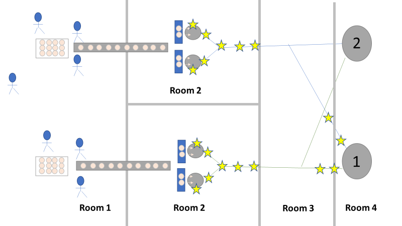 The organism had to be coming from this second thaw vessel chain, right? We thought so too, so we put together a major swabbing effort to see if we could find our bacillus organism. We swabbed both pairs of thaw vessels and the piping leading from them to to pooling vessel. We hoped the pair used for the first 3 runs would function as a control. The stars on the overhead diagram represent the approximate areas we swabbed. Keep in mind, all runs were performed using the pooling vessel marked “1”. The pooling vessel marked “2” (and the piping leading to it) was never used for these engineering runs. The Equipment CIP was performed soon after the 5th run was complete. Swabbing began a few days after the bioburden results were generated, so about a week passed between cleaning and swabbing. Guess what? We saw our Bacillus organism in almost every location we sampled. Both sets of thaw vessels. The counts were highest downstream near the pooling vessel, dwindling to a single colony (if any) on the thaw vessel rims. I gave a couple spoilers about non-root-causes in Part 1 of this series. My spoiler in Part 2: these results were accurate representations of what was swabbed. There were no sampling or testing errors that threw us off. As all raw material moved in a single direction through the equipment, the group came to the following conclusions:
Fortunately, both of those conclusions were dead wrong. Unfortunately, it took two rejected lots to figure that out. In the next part of this story, I’ll explain why the formulaic investigation techniques (i.e. the alphabet soup of techniques listed above) forced the investigation team to continue acting on those conclusions. I’ll also go into how the team should have been looking at this problem. This alternative mindset ended up saving a 3rd lot at the last minute. Check out Part 3, Part 4, and Part 5 here! Welcome to my series about critical investigations I've worked on! This is part 1 of an investigation I call "The Million Dollar Rejected Lots". This investigation determined over two million dollars in raw material needed to be destroyed. First off- writing these stories with an interesting narrative is hard. I want to write these out as a mystery so you can experience what I did going through the investigation. But, with my benefit of hindsight, I know some things that threw off my team during these investigations. Aspects that threw off my team for days turned out to be pretty irrelevant, so it's hard to fit them into the story. I’m struggling to present those aspects in an intriguing way that doesn’t give away the ending. Let’s see how this goes! This investigation was for massive bioburden (Bacillus) contamination seen in upstream processing of a biologic pharmaceutical. The main raw material cost around $1 million for each batch. We had to discard this material for each failing result. The material itself didn’t help. Although we had good reason to believe it was sterile, the material was a nutrient buffet. Think of it as a growth promoting broth ice cube. Spoiler alert- the raw material was not the root cause of this investigation. So what’s our problem statement? A new manufacturing site was performing engineering runs for a new product. Three engineering runs were performed with minimal bioburden recoveries. On the 4th run, bioburden Too Numerous To Count (TNTC, >250 CFU/mL) was recovered from the test sample. The growth was so heavy there were serious conversations about the result being documented as a single colony that happend to grow so big it covered the entire filter. The test sample represents the pooling of all individual units of raw material used for the batch. No excipients or water is added to the batch at this time. The site planned a total of 5 engineering runs. The 6th run was scheduled for commercial sale. Not only was the manufacturing process expensive - the product was a life saving drug in short supply. The pressure was on. Below is a diagram of the raw material processing. The diagram starts where the material is moved out of frozen storage to a non-classifed area. Each bottle is manually placed on a conveyor belt to be taken into an ISO-8 clean room. While on the conveyor belt, the bottles are rinsed with WFI, dried off with compressed air, cut open in the ISO 8 area, then a mechanical transfer arm pours the bottles into a thawing vessel. At this point the frozen broth is melted enough to be pumped through transfer piping to a pooling vessel. When the entire batch of broth (~7000 liters) is in the pooling vessel, the sample is collected. 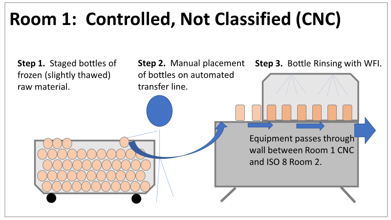 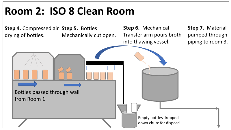 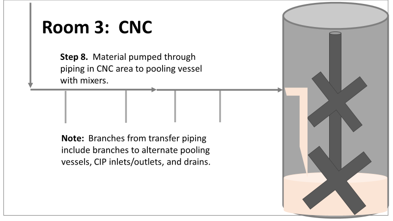 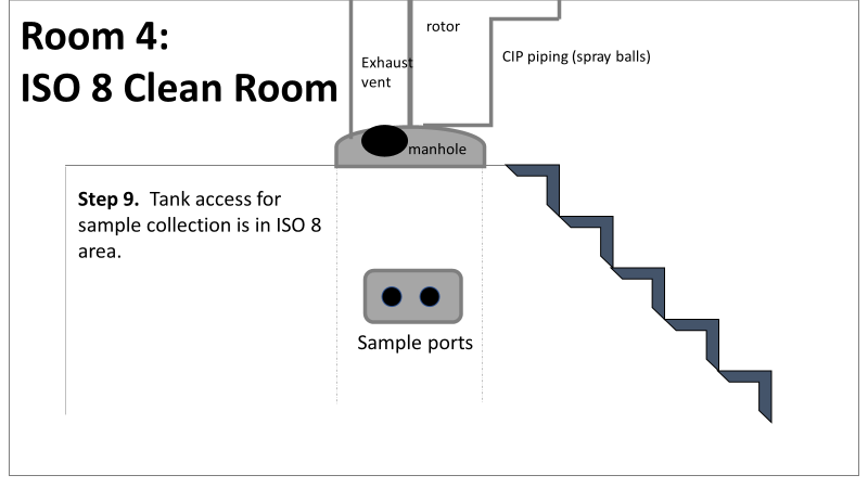 It’s important to note- This process is slow! To speed it up, a total of 4 thaw vessels are used for each batch. The system is even set up to transfer into 2 different pooling vessels as needed. A valve on the transfer piping determined which pooling vessel would receive the broth. Even when all 4 thaw vessels were transferring into a single pooling vessel, it took about 16-20 hours to pool all the broth. The picture below shows how the conveyor belts, pooling vessels, and transfer pipes are set up from a top-down perspective. The stick figures shown in room 1 highlight the amount of activity that occurs there. It is a high traffic area as people transfer product out of freezers, place bottles on the conveyor belt, and monitor the process in multiple ways. Room 2 was off limits while the mechanical transfer arms were operating, but personnel did need to enter the room a few times a run to perform maintenance. 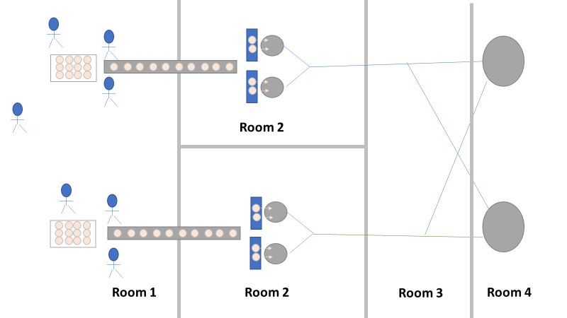 PThere were a few other factors we knew off the bat.
What are your thoughts? What would you look at for this investigation? In part 2, I'll describe the superstar team we put together, what we looked at, and why it was terribly wrong. Links to the following parts here: Part 2 Part 3 Part 4 Part 5 |
